We answer questions like
- What is this data actually telling us?
- How do we present this information clearly to different audiences?
- What should we focus on, and what can we leave out?
- How can use data to drive decisions, not just reports?
- How can we present data in a way that reduces misinterpretation?
How it works
We design visualisations based on your data, your audience, and the decisions you need to support. This includes identifying what matters most, what story the data is telling, and how it should be communicated.
Our team will work with you to determine the best tool for your needs, whether that be a Power BI dashboard, Dash dashboard, infographic or something more bespoke. Where needed, we can bring together multiple data sources and integrate qualitative and quantitative insight to provide a more complete picture. We also support teams to maintain and build on these outputs over time.

What this helps you do

Turn complex data into clear, accessible visuals and dashboards.

Understand what your data is telling you and what matters most.

Communicate insights clearly across different audiences.

Use data to inform decisions, not just report on activity.
Why us?
Our strength is translating complex data into visuals that are easy to interpret and act on. We help you understand the “so what”, not just display the numbers. We design outputs that reduce misinterpretation and support confident decision-making across different audiences.
“I love the way Scarlatti reported our survey results with an easily accessible dashboard with a mechanism to filter.”
 Mhairi Sutherland
B+LNZ
Mhairi Sutherland
B+LNZ
Ready to turn your data into clear, meaningful insight?
Get in touch to create visualisations that support confident decision-making.

Featured articles
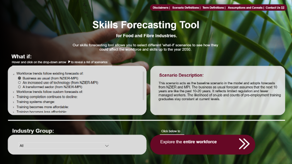
Skills Forecasting for the Food and Fibre Industries
Read on to find out more about the Skills Forecasting Tool we created for the Food and Fibre ISB.
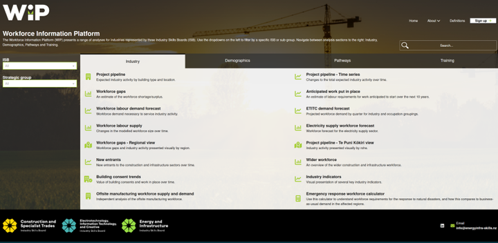
Workforce Information Platform (WIP)
Read on to find out more about the Workforce Information Platform (WIP) that we created for three Industry Skills Boards.
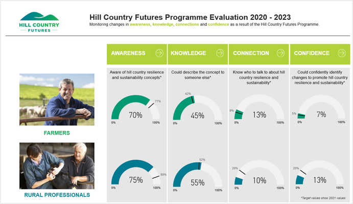
Hill Country Futures survey results
Read on to find out more about the dashboard we created for Hill Country Futures.
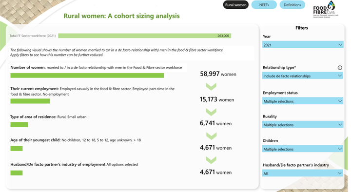
Rural Women in New Zealand
Read on to find out more about the dashboard we created for Food and Fibre Centre of Vocational Excellence.
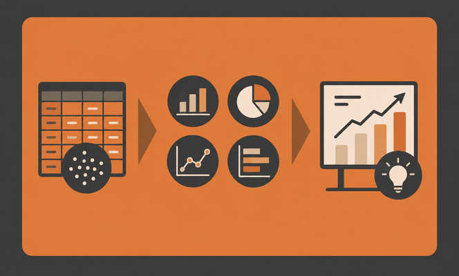
3 principles for turning data in decisions
Learn about three principles for turning dashboard data into clear, evidence-based decisions.
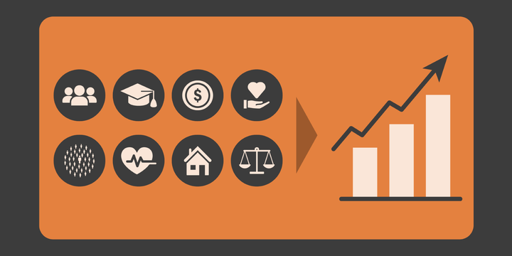
The secret weapon to understanding the people of Aotearoa
Could the Integrated Data Infrastructure be the missing piece you need to ensure your next project is robust, evidence-based and delivers smarter, more meaningful results?